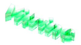
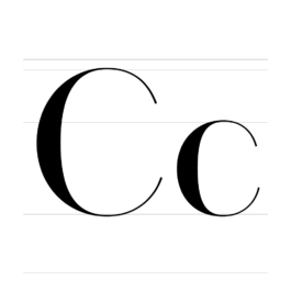
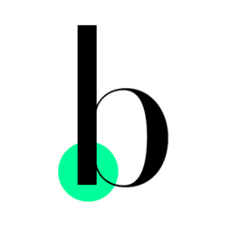
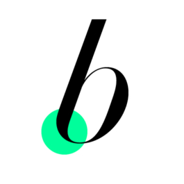
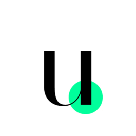
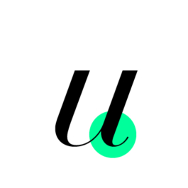
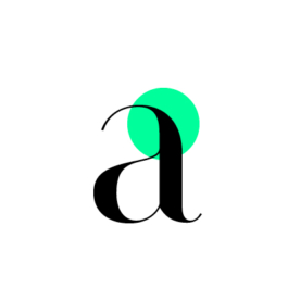
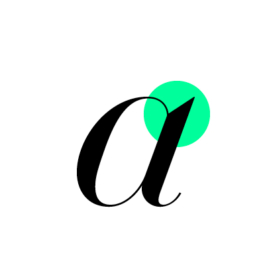
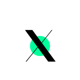
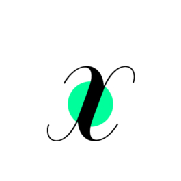
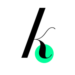
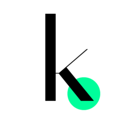
Vitrine is a high-contrast display Sans achieving a see-through quality through formal reduction. Its crystal-clear shapes convey the air of effortless elegance.
Vitrine Razor
Vitrine Thin
Vitrine Extralight
Vitrine Light
Vitrine Regular
Vitrine Medium
Vitrine Semibold
Vitrine Bold
Vitrine Black
Razor Italic
Thin Italic
Extralight Italic
Light Italic
Regular Italic
Medium Italic
Semibold Italic
Bold Italic
Black Italic
Origin
Sometime in 2019, after I had released RT Rondelle and have been designing predominantly low-contrast grotesque typefaces I was looking for a change of direction. Ideally a new genre with new challenges.
I stumbled upon a twitter exchange about the similarities between the skeletons of Helvetica and Didot. The idea that two typefaces with a long history in large size usage and pronounced display qualities could share common grounds across genres sparked my interest.
Out of pure curiousity and without having a clearly defined goal in mind I started looking deeper into the Didot genre to learn more. I particularly wanted to explore how certain attributes play out in large-size typesetting and decided to inspect several contemporary designs as well as older examples found in specimens.
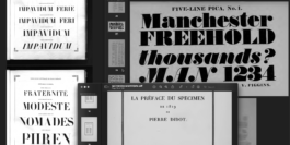
Some of the online specimen found and filed in my RT Vitrine folder during the process.
By the time I began the first sketches of what would later become Vitrine, Covid hit in early 2020 and lockdown measures were taken around the world. I stuck to plenty of online specimens for guidance in this early phase of the project with my time mainly spent in front of my screen. My days alternated between browsing and drawing, extensively immersing myself in my work.
It feels strange and surreal thinking back. While this previously unknown crisis had a tight grip on the world I was moving silly nodes on my laptop. Nonetheless type design was the perfect pastime while travel limitations and social distancing were implemented.
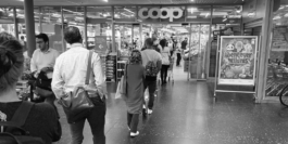
Picture taken 24th of August 2020 in Baden, Switzerland during the implementation of social distancing measures.
Around the same time I noticed display typefaces getting a renewed appreciation by designers. They popped up all over my instagram feed and while many great examples were being released some others triggered a few thoughts. It was important to me to clearly distinguish a display typeface from lettering. Both are sometimes used in similar environments but have strongly differing requirements.
Lettering, a fixed combination of letters needs to work within a specific setting where a typeface needs to be flexible and ideally work with any given letter combination. Compromises are a necessity and compatibility needs to be weighed against expressiveness very carefully to reach the right balance.
Excessive use of ligatures to compensate isolated extravagant shapes go against my understanding of a useful display typeface. With these principles in mind I thought of the challenge to design my own display family as more and more worthwhile.
During the process I reread the article “Through thick and thin: Fashion and type” by Abott Miller, first published in Eye No. 65 vol. 17 2007. He writes:
“[...] It has an almost see-through quality. Because of its radical thick-thin structure, the mass of the letterforms are greatly diminished: words typeset in Didone fonts act as a typographic veil over photography,[...].”
The relationship between image and type has been at the core of graphic design for a long time. Designers have always looked for new ways for them to interact. In fashion, where photography is the predominant medium, the display Didones are even to this day often layed on top of high-quality shots.
Design
Laying the Foundation


wip 1
wip 2
wip 3
Vitrine
Having a visual characteristic compressed in clear words can have a revealing effect. The ‘see-through-quality’ mentioned stroke a chord for me. After having tried a few variations I now cut the serifs and removed the weight from the stroke endings altogether. This formal reduction took the translucence to the next level.
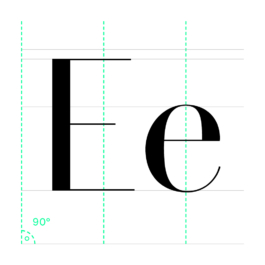
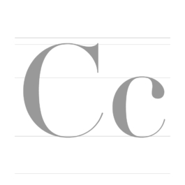
Vitrine also features a Didones characteristic vertical angle of stress meaning the contrast axis relates in a 90° angle to the baseline. Generally speaking we can say that vertical strokes are thick and horizontal strokes are thin. The difference between these stroke thicknesses is called the contrast, which is extremely high in Vitrine and can be a distinct feature of display typefaces.
The unornamented appearance offers a calm and regular rhythm not distracting from the perception of an underlying background. The hairline horizontal strokes which just lightly connect the heavier vertical strokes permit photography to shine through. This aesthetic seemed ubiquitous to me but suddenly also made sense on a formal level.
A further advantage of removing the serifs was that the typeface now could be spaced tighter overall. If needed, designers can even apply negative tracking to achieve a tight-not-touching style of letter spacing, which can be useful for a headline typesetting.
Refining the Foundation
As Vitrine is reduced to its structural elements the points of intervention are greatly minimized. Consequently the effect of every curve and every angle needed to be carefully maximized for even the shortest 3 to 4 letter word to convey a striking presence.
Round shapes: A stylistic trait of Vitrine is the rather quick reduction in weight of thick vertical strokes transitioning into thin horizontal strokes. This more restrictive way of guiding the weight allows the letters to stay light and dynamic where a more generous approach would produce a rather chubby and lethargic letterform.
Medium
Semibold
Bold
Black
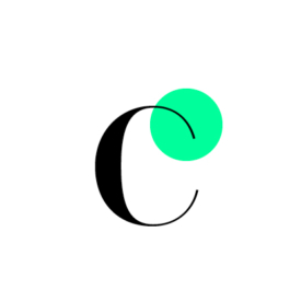
The counters of round glyphs like G are oval with straighter looking segments in their verticals. Therefore the curve is forced to draw into a horizontal within a limited space. In their rather abrupt change of direction the verticality of the whole design is emphasized.
This feature becomes more obvious with increased weight as the glyphs become denser, the counters are squeezed and assume an almost rectangular shape. Supplementarily the outside pathsʼ top and bottom parts have been carefully pressed against the counters to further emphasize the tapering of strokes towards crossing the stress axis.
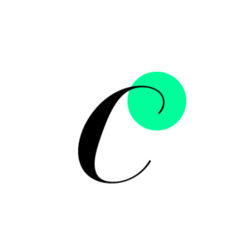
Straight to round: The same strategy is applied to straight stems transitioning into hairlines. On the transition-facing side of the stem the line remains straight for as long as possible to then quickly rush into the hairline terminal stroke.
On the opposite side the curve starts rather abruptly out of the straight stem and looks like a few slices of weight have been shaved off. You can literally feel the curved stroke longing for more weight. Withholding the urge to have a super-smooth transition results in a sharp beak-like shape from stem to hairline.
Straight shapes: Other glyphs are brutal and simplistic in their execution forming a sharp contrast to the delicate handling of hairlines and the careful drawing of the curves. The complex relationship between straight and round, sharp and smooth, delicate and brutal in Vitrine was fine-tuned over long drawing sessions to find the right balance.
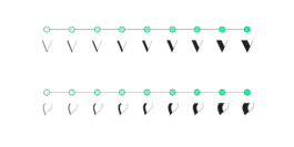
Italics
As a next step after completing the Upright I wanted to decide on the angle of the italic. I slanted several key glyphs in a range from 10° to 20°. After proofing some paragraphs I still wasnʼt sure, so I did what every type designer should do from time to time. I turned to a graphic designer for advice.
Complete Vitrine Regular and Italic shapes in green, overlayed with a visual reduction to its vertical stems in black
Beni Haslimeier is an art-director, lettering artist and long-time friend of mine with whom I regularly have lengthy discussions about type over coffee and cigarettes. Upon showing him my proofs he instantly made an argument that stuck with me:
“The vertical contrast axis, the razor-thin horizontals and the absence of serifs all together reduce horizontal accentuation in Vitrine to a minimum and create a vertical barcode-like pattern throughout the text image. Therefore the diagonality of a higher than usual 20° italic angle will offer a striking distinction between the upright and its italic counterpart.”
During the process we often discussed my raw sketches back and forth via hastily sent screenshots over whatsapp when he often gave me instant feedback while I was drawing. His excitement upon seeing a sketch of a single word containing the first real italic shape made me realize that a simple “slant-and-adjust” approach is not going to suffice here.

Many italic glyphs were modified or even got their very own real italic shape. Initially thinking of this as a simple endeavour the italic became like a new typeface project in itself. Where Vitrine is vertical, straight and linear, Vitrine Italic is diagonal, generous and rounder. I allowed the Italic to flow freely and develop a certain eccentricity. It is wilder and more irregular in its shapes and contrasts the grounded appearance of the upright making the two a powercouple of eye-catching impact.
Open Type Features
Alternate g (ss01)
Alternate y (ss02)
Alternates for g and y can be implemented independently and can change the appearance of the typeface in a subtle but remarkable manner. The rather eccentric-looking alternate shapes are actually quite commonly found throughout Didone typefaces. Just activate stylistic sets SS01 for the alternate g and SS02 for the alternate y via the opentype features.
Swashed Figures (ss03)
Swashed figures! Yes, Vitrine contains a wide range of alternate figures featuring hairline swashes. Default lining figures, old style figures, superscript and subscript figures, fractions and even circled figures... and most of the above in tabular sets as well. They are activated through the stylistic set SS03.
Circled Figures (ss04+ss05)
Figures are available as circled figures in two sets through the stylistic sets SS04 and SS05 as well as swashed when SS03 is activated.
Contextual Alternates (calt)
Contextual alternates are usually active by default in most environments although some actions can cause the feature to be deactivated. Make sure when using Vitrine this feature is active at all times.
The generous end strokes of the default f & j overreach their sidebearings. They enhance the elegant vibe of the typeface but sometimes collide with ascenders, descenders or diacritics. Contextual alternates with shortened end strokes replace the default glyphs whenever necessary. This way you get to keep the style without compromising on functionality.
The Family
Vitrine has a wide range of weights challenging the limits of the design principles set by the Regular weight. The lighter weights down to Vitrine Razor feature thin vertical stems but retain a high enough contrast continuing the spirit of the family. They make for an airy and delicate appearance while retaining a strong enough presence on the page. The bolder weights up to Vitrine Black gain weight in massive amounts and stop on the verge of exploding in a sea of black. The super-heavy style forces the shapes into a tight corset of limitations replacing generous curves with tension-loaded shapes.
Started as an exploration into the field of display type and formal reduction of letterforms, the result is a typeface stripped back to its essence over time, revealing the complex beauty in simplicity. Now exclusively available through RazziaType.
Check out other Razzia typefaces:
Credits
Typeface
Website
Animations
Designed by Mirco Schiavone, RazziaType
Design, copywriting and documentation by Mirco Schiavone, RazziaType
Designed by Mirco Schiavone and animated by Fabian Luginbühl
Vitrine is a high-contrast display Sans achieving a see-through quality through formal reduction. Its crystal-clear shapes convey the air of effortless elegance.
Vitrine Razor
Vitrine Thin
Vitrine Extralight
Vitrine Light
Vitrine Regular
Vitrine Medium
Vitrine Semibold
Vitrine Bold
Vitrine Black
Razor Italic
Thin Italic
Extralight Italic
Light Italic
Regular Italic
Medium Italic
Semibold Italic
Bold Italic
Black Italic
Origin
Sometime in 2019, after I had released RT Rondelle and have been designing predominantly low-contrast grotesque typefaces I was looking for a change of direction. Ideally a new genre with new challenges.
I stumbled upon a twitter exchange about the similarities between the skeletons of Helvetica and Didot. The idea that two typefaces with a long history in large size usage and pronounced display qualities could share common grounds across genres sparked my interest.
Out of pure curiousity and without having a clearly defined goal in mind I started looking deeper into the Didot genre to learn more. I particularly wanted to explore how certain attributes play out in large-size typesetting and decided to inspect several contemporary designs as well as older examples found in specimens.
Some of the online specimen found and filed in my RT Vitrine folder during the process.
By the time I began the first sketches of what would later become Vitrine, Covid hit in early 2020 and lockdown measures were taken around the world. I stuck to plenty of online specimens for guidance in this early phase of the project with my time mainly spent in front of my screen. My days alternated between browsing and drawing, extensively immersing myself in my work.
It feels strange and surreal thinking back. While this previously unknown crisis had a tight grip on the world I was moving silly nodes on my laptop. Nonetheless type design was the perfect pastime while travel limitations and social distancing were implemented.
Picture taken 24th of August 2020 in Baden, Switzerland during the implementation of social distancing measures.
Around the same time I noticed display typefaces getting a renewed appreciation by designers. They popped up all over my instagram feed and while many great examples were being released some others triggered a few thoughts. It was important to me to clearly distinguish a display typeface from lettering. Both are sometimes used in similar environments but have strongly differing requirements.
Lettering, a fixed combination of letters needs to work within a specific setting where a typeface needs to be flexible and ideally work with any given letter combination. Compromises are a necessity and compatibility needs to be weighed against expressiveness very carefully to reach the right balance.
Excessive use of ligatures to compensate isolated extravagant shapes go against my understanding of a useful display typeface. With these principles in mind I thought of the challenge to design my own display family as more and more worthwhile.
During the process I reread the article “Through thick and thin: Fashion and type” by Abott Miller, first published in Eye No. 65 vol. 17 2007. He writes:
“[...] It has an almost see-through quality. Because of its radical thick-thin structure, the mass of the letterforms are greatly diminished: words typeset in Didone fonts act as a typographic veil over photography,[...].”
The relationship between image and type has been at the core of graphic design for a long time. Designers have always looked for new ways for them to interact. In fashion, where photography is the predominant medium, the display Didones are even to this day often layed on top of high-quality shots.
Design
Laying the Foundation
wip 1
wip 2
wip 3
Vitrine
Having a visual characteristic compressed in clear words can have a revealing effect. The ‘see-through-quality’ mentioned stroke a chord for me. After having tried a few variations I now cut the serifs and removed the weight from the stroke endings altogether. This formal reduction took the translucence to the next level.
Vitrine also features a Didones characteristic vertical angle of stress meaning the contrast axis relates in a 90° angle to the baseline. Generally speaking we can say that vertical strokes are thick and horizontal strokes are thin. The difference between these stroke thicknesses is called the contrast, which is extremely high in Vitrine and can be a distinct feature of display typefaces.
The unornamented appearance offers a calm and regular rhythm not distracting from the perception of an underlying background. The hairline horizontal strokes which just lightly connect the heavier vertical strokes permit photography to shine through. This aesthetic seemed ubiquitous to me but suddenly also made sense on a formal level.
A further advantage of removing the serifs was that the typeface now could be spaced tighter overall. If needed, designers can even apply negative tracking to achieve a tight-not-touching style of letter spacing, which can be useful for a headline typesetting.
Refining the Foundation
As Vitrine is reduced to its structural elements the points of intervention are greatly minimized. Consequently the effect of every curve and every angle needed to be carefully maximized for even the shortest 3 to 4 letter word to convey a striking presence.
Round shapes: A stylistic trait of Vitrine is the rather quick reduction in weight of thick vertical strokes transitioning into thin horizontal strokes. This more restrictive way of guiding the weight allows the letters to stay light and dynamic where a more generous approach would produce a rather chubby and lethargic letterform.
Medium
Bold
Semibold
Black
The counters of round glyphs like G are oval with straighter looking segments in their verticals. Therefore the curve is forced to draw into a horizontal within a limited space. In their rather abrupt change of direction the verticality of the whole design is emphasized.
This feature becomes more obvious with increased weight as the glyphs become denser, the counters are squeezed and assume an almost rectangular shape. Supplementarily the outside pathsʼ top and bottom parts have been carefully pressed against the counters to further emphasize the tapering of strokes towards crossing the stress axis.
Straight to round: The same strategy is applied to straight stems transitioning into hairlines. On the transition-facing side of the stem the line remains straight for as long as possible to then quickly rush into the hairline terminal stroke.
On the opposite side the curve starts rather abruptly out of the straight stem and looks like a few slices of weight have been shaved off. You can literally feel the curved stroke longing for more weight. Withholding the urge to have a super-smooth transition results in a sharp beak-like shape from stem to hairline.
Straight shapes: Other glyphs are brutal and simplistic in their execution forming a sharp contrast to the delicate handling of hairlines and the careful drawing of the curves. The complex relationship between straight and round, sharp and smooth, delicate and brutal in Vitrine was fine-tuned over long drawing sessions to find the right balance.
Italics
As a next step after completing the Upright I wanted to decide on the angle of the italic. I slanted several key glyphs in a range from 10° to 20°. After proofing some paragraphs I still wasnʼt sure, so I did what every type designer should do from time to time. I turned to a graphic designer for advice.
Complete Vitrine Regular and Italic shapes in green, overlayed with a visual reduction to its vertical stems in black
Beni Haslimeier is an art-director, lettering artist and long-time friend of mine with whom I regularly have lengthy discussions about type over coffee and cigarettes. Upon showing him my proofs he instantly made an argument that stuck with me:
“The vertical contrast axis, the razor-thin horizontals and the absence of serifs all together reduce horizontal accentuation in Vitrine to a minimum and create a vertical barcode-like pattern throughout the text image. Therefore the diagonality of a higher than usual 20° italic angle will offer a striking distinction between the upright and its italic counterpart.”
During the process we often discussed my raw sketches back and forth via hastily sent screenshots over whatsapp when he often gave me instant feedback while I was drawing. His excitement upon seeing a sketch of a single word containing the first real italic shape made me realize that a simple “slant-and-adjust” approach is not going to suffice here.
Many italic glyphs were modified or even got their very own real italic shape. Initially thinking of this as a simple endeavour the italic became like a new typeface project in itself. Where Vitrine is vertical, straight and linear, Vitrine Italic is diagonal, generous and rounder. I allowed the Italic to flow freely and develop a certain eccentricity. It is wilder and more irregular in its shapes and contrasts the grounded appearance of the upright making the two a powercouple of eye-catching impact.
Open Type Features
Alternate g (ss01)
Alternate y (ss02)
Alternates for g and y can be implemented independently and can change the appearance of the typeface in a subtle but remarkable manner. The rather eccentric-looking alternate shapes are actually quite commonly found throughout Didone typefaces. Just activate stylistic sets SS01 for the alternate g and SS02 for the alternate y via the opentype features.
Swashed Figures (ss03)
Swashed figures! Yes, Vitrine contains a wide range of alternate figures featuring hairline swashes. Default lining figures, old style figures, superscript and subscript figures, fractions and even circled figures... and most of the above in tabular sets as well. They are activated through the stylistic set SS03.
Circled Figures (ss04+ss05)
Figures are available as circled figures in two sets through the stylistic sets SS04 and SS05 as well as swashed when SS03 is activated.
Contextual Alternates (calt)
Contextual alternates are usually active by default in most environments although some actions can cause the feature to be deactivated. Make sure when using Vitrine this feature is active at all times.
The generous end strokes of the default f & j overreach their sidebearings. They enhance the elegant vibe of the typeface but sometimes collide with ascenders, descenders or diacritics. Contextual alternates with shortened end strokes replace the default glyphs whenever necessary. This way you get to keep the style without compromising on functionality.
The Family
Vitrine has a wide range of weights challenging the limits of the design principles set by the Regular weight. The lighter weights down to Vitrine Razor feature thin vertical stems but retain a high enough contrast continuing the spirit of the family. They make for an airy and delicate appearance while retaining a strong enough presence on the page. The bolder weights up to Vitrine Black gain weight in massive amounts and stop on the verge of exploding in a sea of black. The super-heavy style forces the shapes into a tight corset of limitations replacing generous curves with tension-loaded shapes.
Started as an exploration into the field of display type and formal reduction of letterforms, the result is a typeface stripped back to its essence over time, revealing the complex beauty in simplicity. Now exclusively available through RazziaType.
Check out other Razzia typefaces:
Credits
Typeface
Designed by Mirco Schiavone, RazziaType
Website
Design, copywriting and documentation by Mirco Schiavone, RazziaType
Animations
Designed by Mirco Schiavone and animated by Fabian Luginbühl